- John Ruskin- Modern painters, first time anyone described what modern was, used to compare classic.
- William Holman Hun- The Hireling Shepherd. This painting was modern of the moment.
- Modernity- emergence commodity culture, modern means, improved versions, the best and positive progress.
- Tate Modern- not new art, progressive and cutting edge.
- Modernism- looking forward, build on, improve, progressive and constant pushing forward.
- End of modernism according to Charles Jencks (15 July 1972 3.32pm)- modern building knocked down after 20 years. Took a backwards step.
- Paris, modern city (1900) Industrialisation dominant means of production, peoples lives are dominatedby shift work not seasons meaning life becomes regulated, there are rapid advances in technology rather than being stuck in a village people start to travel, 'shrinking the world', mass communication, not intimate. New concepts arising, world time standardised. Life accelerates and rapid changes begin to happen full of discovery.
- URBANISATION.
- Era of cinemas, shopping, arcades and galleries. For example- Hyde Park picture house.
- Enlightenment project- Human knowledge rapid advances, people begin to turn away from religion and look more towards science. This is called Secularisation.
- The city = Modernity
- Eifel Tower is a symbol of modernity, domination of modern over old.
- First people to document cycle of new world were artists. Caillebotte was the painter of modern life, he depicted the experience of an individual in the city, being amongst people but separate.
- Paris became a project of Modernism because it was taken over by communists, it was completely redeveloped and modern buildings and streets were built making it easier for policing. However there were side effects, the working class were segregated, dislocation of individual in the city. From this Modernism = separate, removed from each other, alienation but condensed.
- psychology was born out of modernity because the modern world was predicted to send people crazy by the speed of living.
- Cailleboutte showed the difference in classes, new forms of signifying individuality, fashion, flaneur and displays clothes (hipsters of the day)
- Seurat shows leisure segregation.
- Degas shows the underbelly of modernity, drawing sorrows, being left behind, composition (new form) a cropped style, the composition is similar to photography.
- Kaiserpanorama- 1890, rotunder, it was a large communal viewing device that allowed the public to view; art, landscapes, erotica etc... It allowed people to experience the world through device rather than directly living, not experiencing life more mediating.
- Modernity changes the way people behave and act, it is the response to the modern.
- Monet painted the experience, sensory dislocation using new techniques, experimenting because of the threat of photography creating a new medium.
- Painting is a historical recording of the world where as a photography is more accurate.
- Photography showed modern new views of world, different understanding and nature of the world. Long exposed experiment showing movement, science, investigations and dialect between modernism and art.
- Design in response to modernism; looking forward, invent new styles, always use new processes, materials etc... NO DISGUISE
- Products are practical, useful, aesthetics come second. minimalist stripped down to the core and bare. Modernist international international language of design, universally understandable.
Design Context
Harrison Park
Archives
Lecture 1- Modernity and Modernism
Context of Practice Task 2 Image Analysis Exercise
When first shown the The Uncle Sam Range and the Savile Lumley and asked to compare the two I couldn't find any similarities between them, one was advertising a cooking stove whilst the other was a propaganda poster that was guilt tripping men into fighting in the great war. But after analysing both images in detail similarities start to arise.
Both images symbolise patriotism and pride but in different ways. The Uncle Sam range poster screams in your face patriotism with the room covered head to toe in loud brash stars and stripes, whereas 'Daddy, what did YOU do in the great war?' shows patriotism but in a more subtle way, with the curtain and chair are covered in nationalistic flowers, the English rose and the Fluer de list, but also the boy is playing with Queens guard soldiers as well.
Both images also convey greatness and nationalism, the 'Daddy' poster is created in the middle of WW1 and is envisaging the future and infers that that Britain win. Not only do we win, the solider is alive, healthy and able to have children, but is also affluent. The first thing i notice about the 'Uncle Sam' poster is Uncle Sam is in the centre of the image and attention. America is physically personified through Uncle Sam and the 'World' has come to dinner which represents America being the great leader of the world but also feeding the world.
There are several other ways in which this poster illustrates Americas greatness, one being the list of food that has rolled off the table. It lists countries and their stereotypical staple diets, this is undermining other countries cultures and showing Americas superiority by saying the other cultures are backward and degenerate. But also the countries on the list are where the majority of immigrants come from thus confirming the superiority. Another feature that shows off Americas superiority and greatness is the font used for 'The Uncle Sam Range' it is a Western style font that has a special place in American culture, it represents civilisation, prosperity and going forth.
Both images targets/potential audiences middle class men. It's easy enough to discover the 'Daddy...' poster is aimed at a man just from the statement and the fact that only men were allowed to fight in the war. With the Uncle Sam image it depicts the male as the centre attention, all macho and with guns on the wall over the fire place.. The notion of the man is the bread winner and that is why the range will be aimed at the man because he brings home the bacon and pays the bills. The reason i say it's aimed at middle class is because i believe both images portray the ideal lifestyle of the middle class, for example the Americans idea of middle class at the time was bold, over the top which is depicted by the large oversized range, over the top deco and the house made/slave. Whereas the British image depicts middle class in a more classier grander style by using classier deco and clothing.
OUGD403 Design Skills - Alphabet Soup - Typeface
Kid Acne

This texture/pattern created by Kid Acne is what one of the features Oli admires the most about Kid Acne. These designs are used for texture in hair and for backgrounds, when i look at it I am reminded of leaves or curled stands of hair. I would like to apply a similar texture to type and maybe create type out of the strands but I can't really see how this relates to Oli's personality.


These are some more pieces of Kid Acnes work, both being from Sheffield, Oli can relate to the terms used on these prints. He actually listed a Kid Acne screen print as his most priced possession. It's still going to be relate this to Oli's personality because its the sentences not the fonts or designs that show Oli's personality.
Pete Mckee
Pete Mckee is a Sheffield born painter and commercial artist who is best known as a cartoonist for the Sheffield Telegraphs sports section. He has created his own unique style by using bright colours in his larger than life, often humorous characters that inhabit a world of working men's clubs, bingo halls and family trips to the seaside.

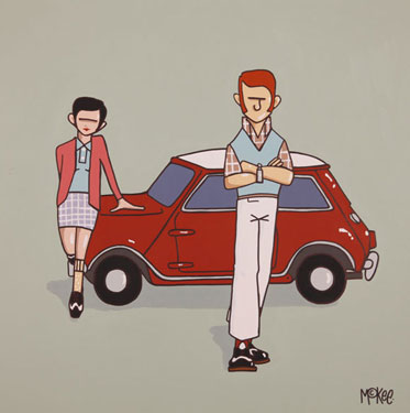


This another artist from Sheffield is another favourite of Oli's. It's going to be extremely difficult to apply this style to a font and relate it to Oli's personality. But this gives me an insight into his personal preferences within graphic design and also into the culture he immerses himself in.
Wes Wilson


This is another one of Oli's favourite artists, Wes Wilson is one of the leading designers of psychedelic poster art. Typography is heavily involved in each of his posters meaning this is a great starting point for my ideas. However, each of his designs uses a unique manipulated font which follows contours and lines of the images which gives it that psychedelic feel. Therefore I will have to design a uniform typeface that works together no matter what the word is. I feel that by using Wes Wilson as inspiration it gives me a lot more freedom with the typeface as I don't have to be as intricate and precise but more free flowing and illustrative. Oli also loves paisley and the mod culture, I thought that if I collaborated the 3 features Kid Acne pattern, Wes Wilson style font and Paisley I will hopefully create a hybrid font that illustrates Oli's personality and interests.


Above are just a few examples of paisley, i'm not really interested in the contents and what's inside. I'm more interested in the shape and outline because eventually I hope to fill them with the Kid Acne pattern.
OUGD401 Context of Practice 1
Love

I love simple design that solves the problem without over doing it. This piece above is a perfect example of what I love, it encoperates minimalist image and type in monochrome but utilises the use of strokes to create texture whikst keeping it simple. The font choice relates to screen printing because it has a classic traditional feel to it with the word 'Quality' but the word 'Screen prints' creates the visual aesthetics that occur from screen printing. The shade of black used also creates the image of screen printed, it's a slightly dull, muted black that occurs when screen printing.
Hate

I detest takeaway leaflets, not only do they clog up my hallway, they're harmful to the environment because all that happens is they eventually get thrown in the bin. But my biggest concern with them is the design, it is absolutely awful. Each takeaway menu is near enough the exact same to the other, they all use the same images, the same basic layout, over clutter the deign and use a poor choice of colour. The designs are so over complicated and clumsy, some menus are near impossible to navigate around. The fact is if done minimally and tastefully in a similar style to my 'love' it could easily be an aesthetically beautiful piece of design.
Alphabet soup: visual thinking OUGD403
Expanded Font

This a typeface called Expand, it's based on solid shapes coming together to create a letterform. This relates to what i'm doing and could serve as inspiration because i could 'expand' or 'inflate' pre existing typefaces or i could expand just specific sections.

The modular font above is such a simple, straight forward font constructed of shapes, the two different variations of the same font above have first of all given me idea of manipulating an existing font such as Helvetica and expanding it into something new such as a modular font. I could also show the progression of the font expanding by using layers or different shades a grey similar to the second series. Aesthetically it's not a good looking font, it's pretty bulky but the overlay font os so much different to the original, i feel the layering adds subtle details to each letter and adds depth.
Concertina Font
I have an idea of a font expanding via a concertina, it could have things expanding out from it, transforming into the full letter. The images bellow are a concertina that if you look at them at a certain angle they form a letter.

This is the concertina font flattened out before it has been folded up. I feel that this technique wouldn't suit my word because it has to be 2-Dimensional. As a 2-D image it would suit the word 'Dissect'


I think that if I take the idea of a concertina and apply it to the font such as descenders it would best suit 'Expand' more, or i could make it look like the whole letter itself is being unfolded by illustrating it.
Alphabet soup: visual thinking OUGD403
Task
"Produce a set, series or sequence of ten letterforms that explore and communicate your interpretation of the word that you have selected from the randomiser"
The word I received was 'Expand' I set about researching definitions and synonyms to give me more of an idea of which direction to go in.
Expand;
- To increase in extent, size, volume, scope etc...
- To spread or stretch, unfold.
- To express in fuller form or greater detail to develop.
Synonyms;
- Amplify
- Bolster
- Bulk up
- Develop
- Enlarge
- Grow
- Heighten
- Inflate
- Magnify
- Spread
- Stretch
- Unfold
- Unravel
Develop;
- To elaborate or expand.
- To bring to a more advanced or effective state.
Amplify;
- To make larger or more powerful, increase.
- To exaggerate.
Magnify;
- To increase the apparent size of.
- To cause, to seem greater or more important, exaggerate, attribute too much importance to.
Unfold/Unravel;
- To reveal or display.
- To spread out.
- To seperate or disentangle the threads.
- To free from complication or difficulty, make plain or clear.
- To take apart.
Alphabet soup: visual thinking OUGD403
Summer Brief Activity
For the summer brief we had to research 30 different examples for each letter of the alphabet, and on Monday we got into groups to bring all our letterform examples to together and classify them into 10 different groups of our choice. However some people hadn't remembered their letterforms therefore we didn't have as big as a selection as we could have had. The ten groups were as follows;
Photographed -

Oblique -

3-Dimensional -

Outline -

Bold -

Serif -

Sans-Serif -

Illustrative -

Handmade -

Uppercase -

This activity helped us as a group but also as individual to gain a better understanding of classifying letterforms and allowed us to share our knowledge of typography with each other. I found this activity very beneficial as i don't normally take an interest in illustrative typography but it helped me understand why some people do choose it.
Subscribe to:
Posts (Atom)
Copyright 2010. All rights reserved.
RSS Feed. This blog is proudly powered by Blogger and uses Modern Clix, a theme by Rodrigo Galindez. Modern Clix blogger template by Introblogger.